洛萨达塞拉诺牙科诊所

下载所需积分: 2
这个项目在某种意义上可以被视为是野兽主义的,因为我们希望几乎不对材料进行处理,就像它刚从工厂出来一样。但从解决建筑问题的角度来看,它也可以被认为是一个极简主义的项目,因为它旨在用最少的元素解决问题。
我们实际上不相信“主义”或标签;我们相信思考、组织和简化,以解决“技术情况与美学和谐”的问题。
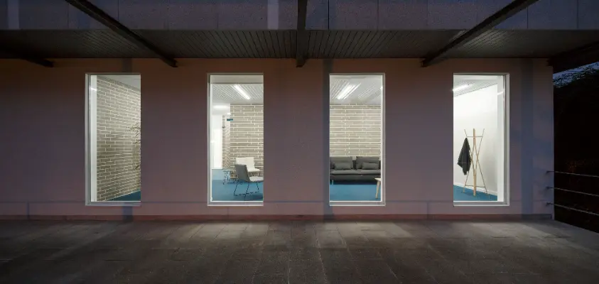
这家牙科诊所的新设施位于现有建筑的底层。项目的内容包括对空间和外立面的完整装修,以建造三个牙科诊室。设计回应了两个基本问题:三个诊室之间的关系以及候诊室的突出位置。
一方面,我们希望工作空间闭合于室外,立面上没有任何洞口,但尽可能向内打开,以获得尽可能多的自然光。为此,最大程度地增加了正对主要街道和内部广场的开口,这些开口是朝向最佳视野的地方,恰好是候诊室所在的地方,客户在那里应该真正感到舒适。
三个岛屿构成了空间的组织,每个岛屿包含一个诊室。中央岛屿配置了通道和候诊区,生成了周边循环访问 - 候诊 - 诊疗 - 出口。另外两个岛屿,由于它们的位移,定义了诊室之间的大厅和私人区域的通道。
在建设方面,我们希望尽可能地使用原始材料。
面砖定义了岛屿的边界,作为立面上开口的背景,并为诊所带来了温暖和个性。
在灰色砖墙之间,正面采用了明确的技术取向:用木质槽条条 - 原厂颜色 - 改善了场地的声学,并确保了最大限度的自然光线,同时又不失私密性,采用了缝隙玻璃。
这些垂直线条继续延伸到地板上,采用纺织涂层的解决方案,加强了诊所的个性特色,并在天花板上 - 波纹板金属 - 再次改善了场地的声学,并自然地集成了照明设备。
公共空间与服务空间之间存在明显的对比 - 友好、温暖和微妙的公共空间与白色、无害和干净的服务空间之间产生了不同的体验。
在白色空间中也不忽视细节,比如有色的接缝和不同的瓷砖布局。
It could be considered a brutalist project in the sense that we wanted to work with the material almost as it leaves the factory. But it could also be considered a minimalist project from the point of view that aims to solve the construction with the minimum elements.
We do not really believe in “-isms” or labels; we believe in thinking, organizing and simplifying to solve ‘technical situations with aesthetic harmony’.
The new facilities of this dental clinic were located in the low level from an existing building. The project consisted in the complete conditioning of the space and its facades to build three dental cabinets. The design responds to two essential questions: the relationship between the three cabinets and the preeminent location of the waiting room.
On the one hand, it was sought that the work spaces were closed to the outside, without any hollow in the facade, but as open as possible to the interior to capture the maximum amount of natural light possible. For this, the opening of hollows in front was maximized towards the main street and towards an inner plaza with the best views; where precisely the waiting room is located, the place where the customer really should feel at ease.
Three islands make up the organization of space and each of them contains a cabinet. The central island configures the circulations and the waiting area, generating a perimeter circulation access − waiting − attention − exit. The other two islands, due to their displacement, define the hall between cabinets and the access to private areas.
Constructively it has been wanted to work with the raw material as much as possible.
The face brick defines the perimeters of the islands, functioning as a backdrop to the openings on the facade and bringing warmth and character to the clinic.
Amongst the gray brick walls, fronts are executed with a clear technical vocation: to improve the acoustics of the premises, with wooden grooved frieze strips - with factory color -, and guarantee the maximum amount of natural light without losing intimacy with slotted glass.
This set of vertical lines is continued on the floor, with a textile vinyl solution that reinforces the personal character of the clinic, and on the ceilings - corrugated sheet metal -, again to improve the acoustics of the premises and in turn integrating the luminaires in a natural way.
There is a clear opposition between public spaces - friendly, warm and subtle - with service spaces - whites, innocuous and clean to generate a different experience between waiting and service.
Not without neglecting details in the white spaces as the colored joints and the different dispositions of the tiling.